UX and Accessibility

UX and Accessibility

Repair-your-reservoir
Web Design, Content Creation Strategies, Focus and Productivity, Inspiration, Marketing and SEO Tips, Productivity, UX and Accessibility

A Dam Good Idea – Day 3: Repairing Your Reservoir

Introduction to Repair Your Reservoir You don’t have to lose everything to feel like you’re running dry. Sometimes the problem isn’t lack of effort—it’s a slow, quiet leak. If you’ve ever ended a week wondering where your energy, time, or income went… this post is for you. Understanding how to repair your reservoir is crucial […]

, ,

A Dam Good Idea – Day 3: Repairing Your Reservoir Read Post »

Cf1f2c96 724b 42fd b210 fe27e8979f43 1
Web Design, Content Creation Strategies, E-Commerce, Inspiration, Marketing and SEO Tips, Search and SEO Tips, SEO, UX and Accessibility

One Clear Mountain Top Experience

You’ve mapped the route. You’ve cleared the path. Now give your visitors what they came for: a mountain top experience. Your Funnel Isn’t About Pressure—It’s About Arrival All along the way, you’ve been answering quiet questions: By now, your visitor should feel one thing: relief. They’re not being sold to. They’re being invited forward. All

, , , , , , , , , , , , , , ,

One Clear Mountain Top Experience Read Post »

4dc8ee8b 77f9 4daa b6cf 3abc8bc9b08c 1
Content Creation Strategies, Marketing and SEO Tips, Responsive Website Design, Search and SEO Tips, SEO, UX and Accessibility

Offer Fewer Paths, Not More Clutter

It’s important to offer fewer paths If someone lands on your website and doesn’t know where to go next, It’s tempting to give them more options. But that doesn’t create clarity. It creates hesitation. And hesitation is the enemy of action. Too Many Roads = No Direction Imagine a trailhead with twelve signs pointing in

, , , , , , , , , , , , , , , ,

Offer Fewer Paths, Not More Clutter Read Post »

0e427eb1 4f21 48c0 b96f 9751ffcf3548 1
Web Design, Marketing and SEO Tips, Responsive Website Design, Search and SEO Tips, SEO, UX and Accessibility

What Visitors Want on Their First Click

(And Why Most Sites Miss It) What visitors want when they reach your site—whether through a Klaviyo campaign, a Google search, or a referral from a friend—they’ve already made a small decision: to give you a shot. But that click doesn’t mean they’re ready to buy. In fact, most of the time, they’re not even

, , , , , , ,

What Visitors Want on Their First Click Read Post »

07564630 e42b 4879 a295 8f2ed06c5f1b 1
Web Design, Content Creation Strategies, Focus and Productivity, Marketing and SEO Tips, Search and SEO Tips, SEO, UX and Accessibility

From Entry to Action: The Website Funnel Starts Before Your Homepage

Most people assume their website funnel begins on the homepage. That’s a common mistake. In reality, the path to your site often starts well before someone ever types in your domain. They’re coming from: These aren’t theoretical examples—they’re happening every day. If your site only works when someone starts at “Step One,” you’re already losing

, , , , , , , , , , , , ,

From Entry to Action: The Website Funnel Starts Before Your Homepage Read Post »

16344463 d90f 4141 a76b c5514984192f 1
Search and SEO Tips, Marketing and SEO Tips, Responsive Website Design, SEO, UX and Accessibility, Web Design

Tag Clouds, Categories, and the Myth of Discovery

Refined, Not Reduced – Navigation Series, Part 6 There’s a persistent idea that if you just tag everything enough or offer a massive list of categories visitors will stumble into the perfect piece of content.   In practice, it’s more like walking into a library with no map, no signage, and a helpful announcement saying,

, , , , , , , , , , ,

Tag Clouds, Categories, and the Myth of Discovery Read Post »

51cfc2ae b34e 4c7f 9315 cbdb4454bd7f 1
UX and Accessibility, Responsive Website Design, Search and SEO Tips, SEO, Web Design

Footers, Not Dumpsters

Refined, Not Reduced – Navigation Series, Part 5 The footer is the last part of your site people see and usually the last thing anyone designs on purpose. Too often it becomes a digital junk drawer: half-finished navigation, legalese, broken links, outdated phone numbers, a copyright line from three years ago, and one button that

, , , , , , , , , ,

Footers, Not Dumpsters Read Post »

586c8be9 4fa8 494c aa46 b6b3106f9412 1
UX and Accessibility, Content Creation Strategies, Search and SEO Tips, Web Design

Table of Contents vs. Table of Chaos

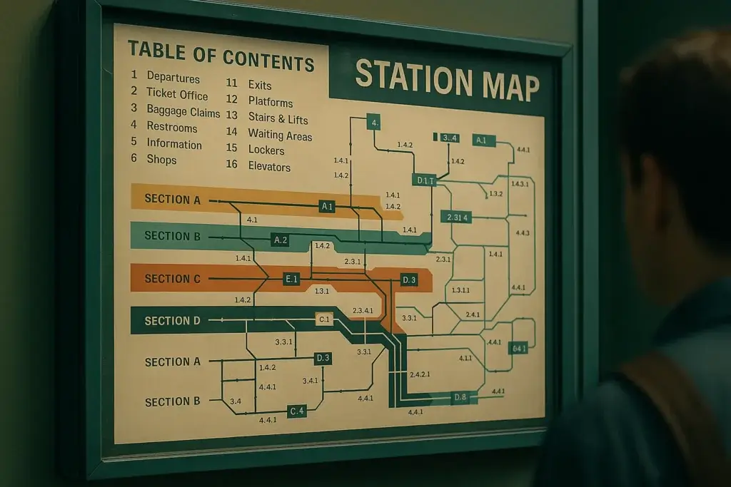
Refined, Not Reduced – Navigation Series, Part 3 Table of contents blocks are like station maps at a busy terminal: great when they work, frustrating when they don’t, and often ignored if they feel like too much. If your site includes longform content, multi-part guides, or bundled services, a clear TOC isn’t optional, it’s an

, , , , , , , , , , ,

Table of Contents vs. Table of Chaos Read Post »

C327d9e5 4323 4af1 b73b 24d4386a5637 1
UX and Accessibility, Content Creation Strategies, Marketing and SEO Tips, Responsive Website Design, Search and SEO Tips, SEO

Why Your Services Page Feels Like a Diner Menu from 1986

Refined, Not Reduced – Navigation Series, Part 2 Your services page might be trying to do too much. If you’ve got 12 packages, 3 discovery options, and something called “Custom Tier X” you might be unintentionally overwhelming visitors who just want to know what you do and how to start. It’s like one of those

, , , , , , , , ,

Why Your Services Page Feels Like a Diner Menu from 1986 Read Post »

544f31c7 ef90 476f abe8 1727b65871fe 1
UX and Accessibility, Responsive Website Design, Search and SEO Tips, SEO

5-Common-Website-Menu-Mistakes-And-How-ToFix-Them

Your website menu isn’t just a list of pages—it’s a compass. A good one guides visitors, builds trust, and helps users find exactly what they need. But when your menu is unclear, crowded, or inconsistent, it becomes a barrier instead of a bridge. After years of working on client websites—both new builds and rescue projects—I’ve

, , , , , , , ,

5-Common-Website-Menu-Mistakes-And-How-ToFix-Them Read Post »

Scroll to Top