Responsive Website Design

Responsive Website Design

38a36340 a66e 437e 9753 ffed264361d0 1 1
Content Creation Strategies, Creativity, Focus and Productivity, Productivity, Responsive Website Design, Values, Web Design

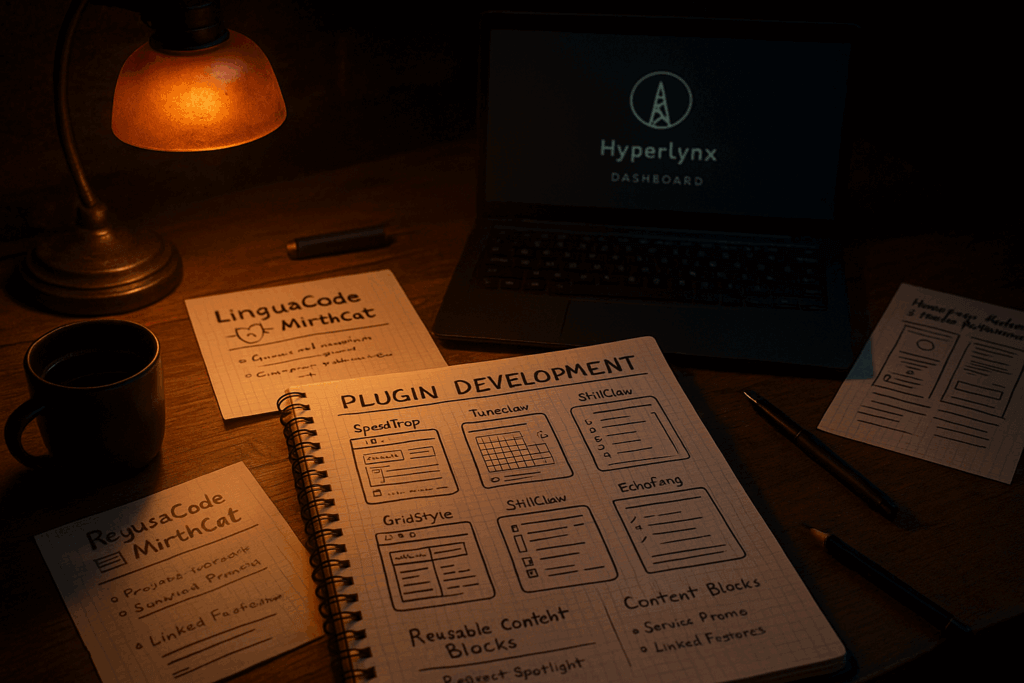
What I’ve Been Building (Instead of Blogging)

It’s been a few days since my last post—not because I’ve run out of ideas, but because I’ve been elbows-deep in something new: plugin development. This is a fresh frontier for me. I’ve worked with WordPress for years—designing, fixing, optimizing—but now I’m stepping into creating tools I’ve wished existed for a long time. Tools I […]

, , , , , , , ,

What I’ve Been Building (Instead of Blogging) Read Post »

4dc8ee8b 77f9 4daa b6cf 3abc8bc9b08c 1
Content Creation Strategies, Marketing and SEO Tips, Responsive Website Design, Search and SEO Tips, SEO, UX and Accessibility

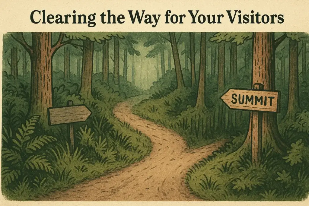
Offer Fewer Paths, Not More Clutter

It’s important to offer fewer paths If someone lands on your website and doesn’t know where to go next, It’s tempting to give them more options. But that doesn’t create clarity. It creates hesitation. And hesitation is the enemy of action. Too Many Roads = No Direction Imagine a trailhead with twelve signs pointing in

, , , , , , , , , , , , , , , ,

Offer Fewer Paths, Not More Clutter Read Post »

0e427eb1 4f21 48c0 b96f 9751ffcf3548 1
Web Design, Marketing and SEO Tips, Responsive Website Design, Search and SEO Tips, SEO, UX and Accessibility

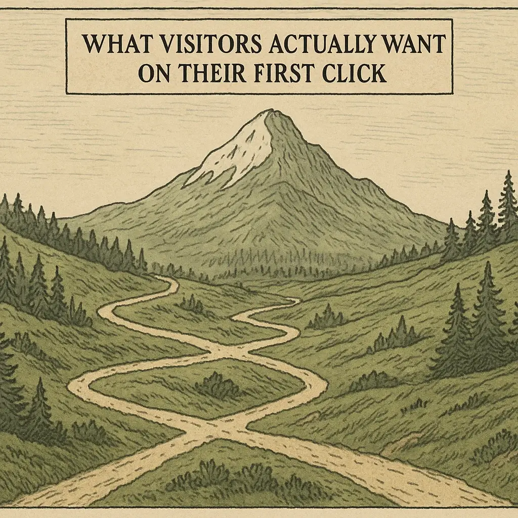
What Visitors Want on Their First Click

(And Why Most Sites Miss It) What visitors want when they reach your site—whether through a Klaviyo campaign, a Google search, or a referral from a friend—they’ve already made a small decision: to give you a shot. But that click doesn’t mean they’re ready to buy. In fact, most of the time, they’re not even

, , , , , , ,

What Visitors Want on Their First Click Read Post »

16344463 d90f 4141 a76b c5514984192f 1
Search and SEO Tips, Marketing and SEO Tips, Responsive Website Design, SEO, UX and Accessibility, Web Design

Tag Clouds, Categories, and the Myth of Discovery

Refined, Not Reduced – Navigation Series, Part 6 There’s a persistent idea that if you just tag everything enough or offer a massive list of categories visitors will stumble into the perfect piece of content.   In practice, it’s more like walking into a library with no map, no signage, and a helpful announcement saying,

, , , , , , , , , , ,

Tag Clouds, Categories, and the Myth of Discovery Read Post »

51cfc2ae b34e 4c7f 9315 cbdb4454bd7f 1
UX and Accessibility, Responsive Website Design, Search and SEO Tips, SEO, Web Design

Footers, Not Dumpsters

Refined, Not Reduced – Navigation Series, Part 5 The footer is the last part of your site people see and usually the last thing anyone designs on purpose. Too often it becomes a digital junk drawer: half-finished navigation, legalese, broken links, outdated phone numbers, a copyright line from three years ago, and one button that

, , , , , , , , , ,

Footers, Not Dumpsters Read Post »

Fff78252 76b7 4712 b264 db99cda7bc37 1
Web Design, Marketing and SEO Tips, Responsive Website Design, Search and SEO Tips

Sidebars That Actually Help

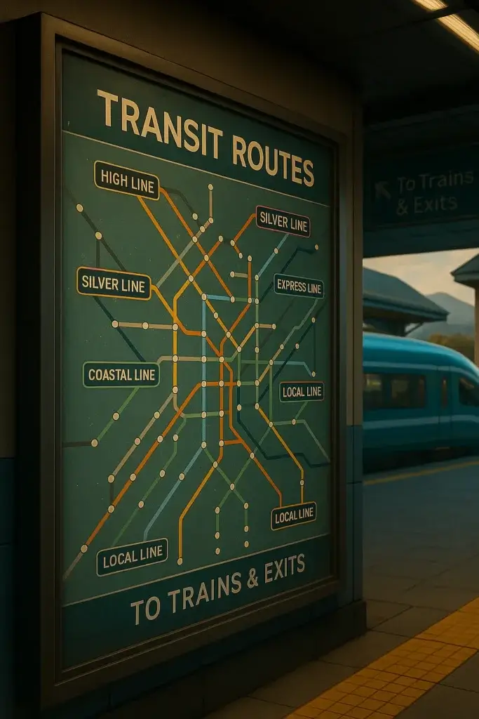
Refined, Not Reduced – Navigation Series, Part 4 There was a time when every website had a sidebar. Then came the trend to kill them. But the truth is when used well sidebars are incredibly useful. They just got lazy. A good sidebar acts like a station attendant: always off to the side, rarely flashy,

, , , , , , , , , , , , ,

Sidebars That Actually Help Read Post »

C327d9e5 4323 4af1 b73b 24d4386a5637 1
UX and Accessibility, Content Creation Strategies, Marketing and SEO Tips, Responsive Website Design, Search and SEO Tips, SEO

Why Your Services Page Feels Like a Diner Menu from 1986

Refined, Not Reduced – Navigation Series, Part 2 Your services page might be trying to do too much. If you’ve got 12 packages, 3 discovery options, and something called “Custom Tier X” you might be unintentionally overwhelming visitors who just want to know what you do and how to start. It’s like one of those

, , , , , , , , ,

Why Your Services Page Feels Like a Diner Menu from 1986 Read Post »

544f31c7 ef90 476f abe8 1727b65871fe 1
UX and Accessibility, Responsive Website Design, Search and SEO Tips, SEO

5-Common-Website-Menu-Mistakes-And-How-ToFix-Them

Your website menu isn’t just a list of pages—it’s a compass. A good one guides visitors, builds trust, and helps users find exactly what they need. But when your menu is unclear, crowded, or inconsistent, it becomes a barrier instead of a bridge. After years of working on client websites—both new builds and rescue projects—I’ve

, , , , , , , ,

5-Common-Website-Menu-Mistakes-And-How-ToFix-Them Read Post »

Focus on responsive design
Web Design, Responsive Website Design

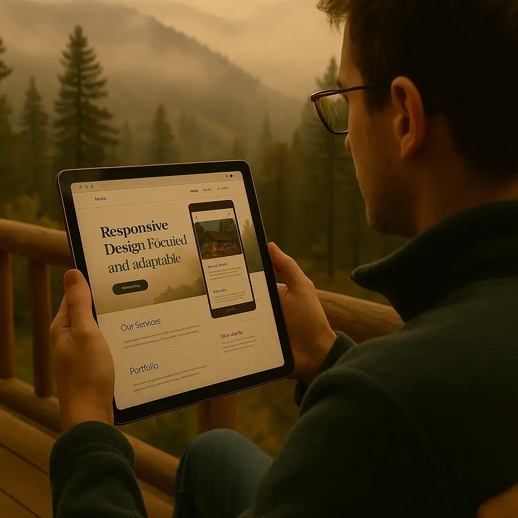
Focus in Responsive Design: Clarity at Every Size

When I view my own site from the porch with a tablet, or glance at it from my phone while waiting in line, one thing’s always clear: A good focus in responsive design doesn’t just shrink…it adapts.Focus should shift based on context, not disappear. Responsive design isn’t just technical it’s editorial.It’s about deciding what stays

Focus in Responsive Design: Clarity at Every Size Read Post »

3ac59440 c098 4bf3 965b d1ccf5a3c124 1
Content Creation Strategies, Focus and Productivity, Photography, Responsive Website Design

Selective Focus: Why “Blurring” Is a Strategy

In photography, one of the most powerful tools is selective focus—deliberately keeping only a portion of the image sharp while letting the rest fall softly out of view. The subject stands out. Your eye knows exactly where to go. That’s the metaphor we’re using here—not a Photoshop trick, not a blur effect. We’re talking about

, , , , ,

Selective Focus: Why “Blurring” Is a Strategy Read Post »

Scroll to Top